Why Your Prescription Label Looks Different Every Time
You fill your blood pressure med at CVS, then refill it at Walgreens a month later-and suddenly the label looks completely different. The font is smaller. The instructions are worded differently. The reason for the prescription? Gone. You pause. Did you miss something? Did the pharmacy make a mistake? You’re not alone. Millions of people experience this exact confusion every year. And it’s not random. It’s the result of a broken system.
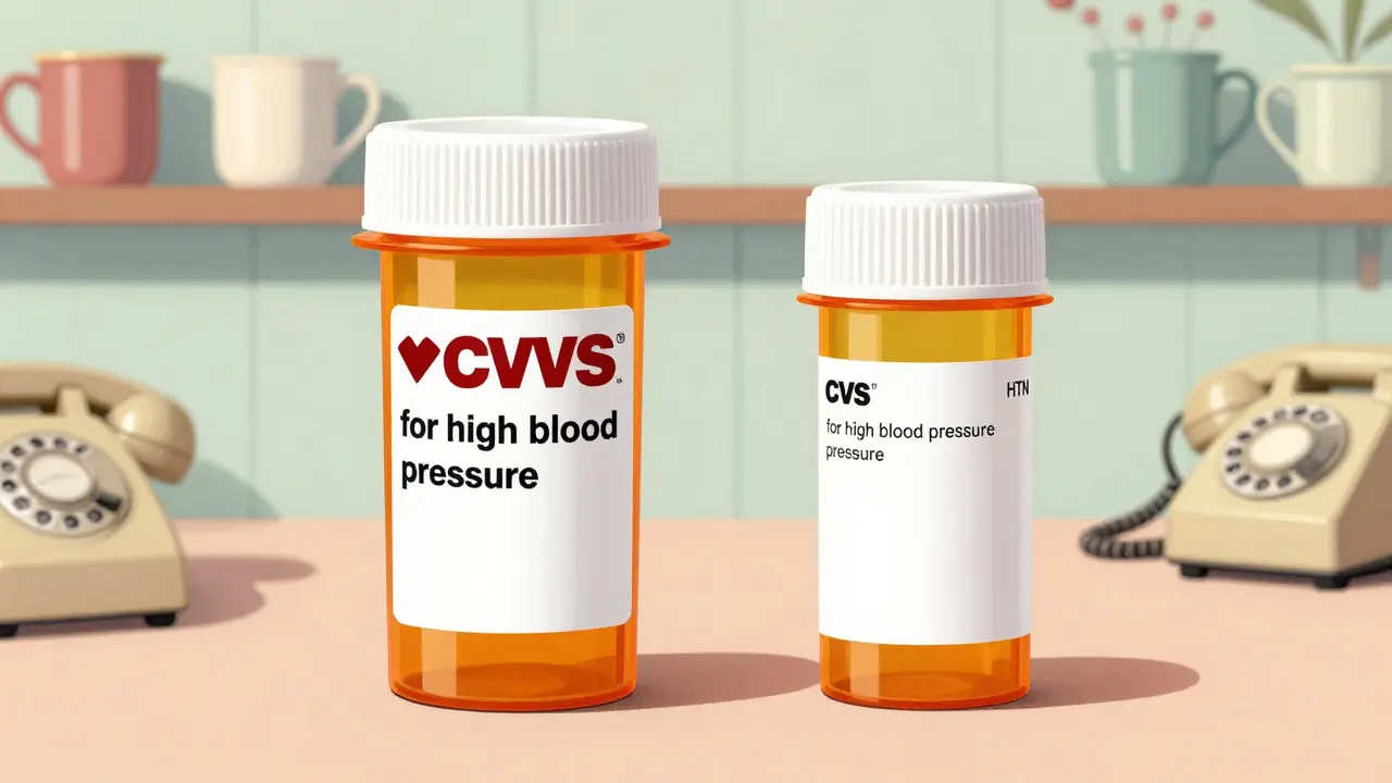
In the United States, there is no single rule for what a prescription label must look like. No national standard. No uniform design. That means your label depends on where you live, which pharmacy you use, what software they run, and whether your state even bothers to follow the few guidelines that exist. One pharmacy might print in bold, clear 12-point Arial. Another uses tiny 8-point Times New Roman. One includes the reason for the medication-like "for high blood pressure"-another just says "HTN." One puts the dosage instructions at the top. Another buries them in the middle. And if you’re blind, have low vision, or don’t speak English well? Good luck.
The Rules That Do Exist (And Why They Don’t Matter)
The FDA does require a few basic things: your name, the drug name, the dosage, and the "Rx only" symbol. That’s it. Everything else? Up for grabs. The FDA’s rules are meant for doctors and pharmacists reading the official drug inserts-not for you, the person swallowing the pill. Meanwhile, the United States Pharmacopeial Convention (USP) published General Chapter <17> in 2012. This was the first real attempt to create patient-friendly label standards. They recommended clear, sentence-case text. Sans-serif fonts like Arial. Black ink on white paper. 1.5 line spacing. No fancy fonts. No condensed letters. And most importantly: tell patients why they’re taking the medicine.
But here’s the catch: USP <17> is voluntary. States decide whether to adopt it. As of 2023, only 28 out of 50 states have fully embraced these standards. Texas requires the pharmacy’s phone number and prescription ID in at least 10-point font. California demands bilingual labels for certain drugs. New York has its own spacing rules. Florida? Different again. So even if your local pharmacy wants to follow USP <17>, they might be legally required to add something their software doesn’t support-or remove something their state bans.
Why Your Pharmacy’s Software Makes It Worse
There are about a dozen major pharmacy management systems used across the U.S. Each one generates labels differently. Even within the same chain-say, Rite Aid-you might get a different label depending on which store you visit. Why? Because one location uses ScriptPro, another uses McKesson, and a third uses QS/1. These systems weren’t built to talk to each other. They don’t share label templates. They don’t follow the same formatting rules. So when you refill your prescription at a different branch, you’re not just getting a new bottle-you’re getting a new design.
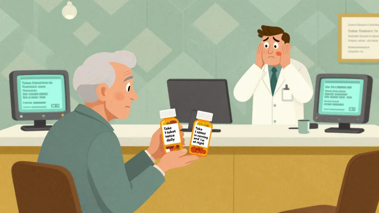
Pharmacy technicians report that nearly three-quarters of them have had customers come back confused because the label changed between refills. One patient took double the dose of a blood thinner because the refill label said "take 1 tablet twice daily" while the original said "take 1 tablet in the morning and 1 at night." The wording was technically the same, but the layout made it look like two separate pills instead of one pill, two times a day. That’s not a patient error. That’s a system failure.
What’s Missing: The Most Important Part
Most labels don’t say why you’re taking the medicine. Instead of "for high blood pressure," you get "for hypertension." Instead of "for anxiety," you get "for GAD." That’s medical jargon. And it’s dangerous. A 2021 survey found that 68% of patients struggle to understand their labels at least sometimes. One in five have made a medication error because of it.
When a label says "take one tablet daily," but doesn’t say why, patients stop taking it. They think, "I feel fine. Do I still need this?" If the label says "for high blood pressure," they remember: "This keeps me from having a stroke." That simple addition increases adherence by up to 20%, according to studies. Yet most pharmacies still skip it. Why? Because their software doesn’t prompt them to enter it. Because their state doesn’t require it. Because it’s easier to print the same template for every drug.
Accessibility? Most Pharmacies Don’t Even Try
What if you can’t read small print? What if you’re blind? What if English isn’t your first language? USP <17> says pharmacies should offer large print, braille, or audio labels. But here’s the reality: a 2022 audit found only 38% of pharmacies consistently offer large print. Only 12% offer braille. Just 5% offer audio labels. And even when they do, the audio version often doesn’t match the print version. The order of information changes. Key details get dropped. The label becomes useless.
Pharmacists are supposed to offer these options. But most don’t. They don’t have the training. They don’t have the time. They don’t have the tools. And patients? They don’t know to ask. So millions of people with vision loss, dementia, or limited English are left guessing what’s in their bottle.
Why This Isn’t Just Inconvenient-It’s Deadly
Medication errors kill more than 250,000 people in the U.S. every year. That’s the third leading cause of death. And inconsistent labeling is a major contributor. The Institute for Safe Medication Practices says name confusion and unreadable labels are the top two reasons people mess up their meds. Research shows that if every prescription label followed USP <17> standards, medication errors could drop by 30 to 40%.
Between 2019 and 2022, Texas pharmacists reported 417 errors directly tied to confusing labels. That’s not a glitch. That’s a pattern. And it’s happening everywhere. The cost? $29 billion a year in preventable hospital visits, ER trips, and lost productivity. We spend billions on new drugs. But we won’t spend a few thousand to fix the label on the bottle.
Change Is Coming-Slowly
Some progress is happening. CVS Health announced in 2023 that it will roll out USP <17> labels to all 10,000+ of its pharmacies by the end of 2024. After testing in 500 stores, they saw a 33% drop in patient questions. That’s huge. Other chains are watching. The FDA released draft guidance in mid-2023 suggesting they might finally step in and enforce patient-friendly labeling. The Biden administration set a goal: 90% of states will adopt standardized labeling by 2026.
But change moves slowly. Pharmacy systems are outdated. Staff are overworked. State laws are tangled. And until every pharmacy, every state, and every software vendor gets on the same page, you’ll keep getting different labels. You’ll keep wondering if you’re taking your meds right.
What You Can Do Right Now
- Always read the label carefully-even if you’ve taken the same pill for years. Format changes.
- Ask for the reason-if it’s not on the label, ask the pharmacist: "Why am I taking this?" Write it down.
- Request accessible formats-ask for large print, audio, or bilingual labels. They’re legally allowed to provide them.
- Take a photo-when you get a new label, snap a picture. Compare it to your last refill. If it looks different, ask why.
- Use a pill organizer-with clear labels and times. It helps even if the bottle label is messy.
Medication safety isn’t about fancy tech or expensive apps. It’s about a simple, clear label. One that says what you need to know, when you need to know it. No jargon. No guesswork. Just the facts.
Frequently Asked Questions
Why do prescription labels look different between pharmacies?
Because there’s no federal law requiring a standard design. Each state sets its own rules, and pharmacies use different software systems that generate labels differently. Even within the same chain, two locations might print labels with different fonts, spacing, or information based on their local setup.
Is there a national standard for prescription labels?
Yes, but it’s not required. The USP General Chapter <17> provides clear, evidence-based guidelines for patient-friendly labels-like using Arial font, black text on white, and including the reason for the medication. But only 28 states have adopted it, and even then, enforcement varies. The FDA only requires basic info like your name and dosage, not readability or clarity.
Why doesn’t my label say why I’m taking this medicine?
Most pharmacy systems don’t require pharmacists to enter the reason for the prescription. Even when they do, many states don’t require it to appear on the label. But including it-like "for high blood pressure" instead of "for HTN"-helps patients remember why they need the drug and improves adherence. If it’s missing, ask your pharmacist to add it.
Can I ask for a large-print or audio label?
Yes. Under USP <17> guidelines and the Americans with Disabilities Act, pharmacies must provide accessible label formats if requested. This includes large print, braille, or audio versions. Many pharmacies don’t offer them because they lack the tools or training, but you have the right to ask. If they say no, ask to speak to the pharmacist-in-charge.
What should I do if my label changes between refills?
Don’t assume it’s the same. Compare the new label to your old one. Check the dosage, frequency, and purpose. If anything looks different-font size, wording, spacing-ask the pharmacist to explain the change. Take a photo of your current label so you can reference it next time. Changes in layout can lead to dangerous misunderstandings, especially with blood thinners, insulin, or seizure meds.
jay patel
February 3, 2026 AT 05:23Ansley Mayson
February 4, 2026 AT 18:10Hannah Gliane
February 6, 2026 AT 10:09Murarikar Satishwar
February 6, 2026 AT 12:07Akhona Myeki
February 7, 2026 AT 02:46Brett MacDonald
February 8, 2026 AT 19:48Monica Slypig
February 9, 2026 AT 15:34Becky M.
February 11, 2026 AT 11:30phara don
February 12, 2026 AT 17:14